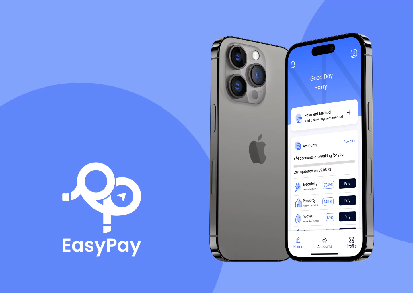
Easypay, a prominent platform for handling diverse payments from various service providers, both municipal and private, is tailored for seamless integration with a multitude of service providers. This adaptability aims to alleviate the inconvenience associated with monthly bill payments. Rigorously vetted by finance and privacy experts, Easypay provides users with a comprehensive toolset to consolidate their monthly bills in one centralized location, mitigating the likelihood of misunderstandings.
Roles
This is a concept project where I assumed the following roles:
Interaction Design: High-fidelity interactive prototype for key tasks on iOS
UX/UI Design:
Competitive analysis
User surveys and one-on-one interviews
User personas
Task flows
Journey maps
App maps
Low fidelity wireframes and prototype
High fidelity prototype
Usability tests and findings
Project Specifications
Duration: 6 weeks Tools:
Figma
Miro
Photoshop
Illustrator
The Opportunity
Easypay stands out as a unique solution, tailored for individuals managing their households manually. While service providers have their own payment platforms, Easypay fills the void by providing a centralized solution, streamlining payments, and avoiding potential penalties due to confusion or delays.
This innovative application addresses this gap by offering a singular solution for individuals seeking to streamline their bill payment procedures. Easypay not only fills a crucial void but also sets a precedent for applications targeting specific audiences with tailored solutions. It redefines the landscape for future developments in this specialized space.
Proposed Features
Efficient Payment Handling: Seamless integration with diverse service providers for bill payment, alerts, and tracking.
User-Friendly Time Management: Provides a straightforward and intuitive process for users
Scheduled Payments: Allows scheduling of regular payments (non-direct debit) for proactive tracking, preventing unnecessary charges and misunderstandings.
Design Approach
Designing screens prioritizing intuitive and swift bill payments.
Adapting user journeys for seamless onboarding of new accounts.
Documenting and presenting the payment process for user comprehension and reference
Research
In my research, I conducted a comprehensive competitive analysis focusing on the user experience of digital bill payments and task management. I scrutinized various sites and apps to understand users’ payment habits, issues like duplicated payments, and factors influencing effective problem resolution. User surveys identified crucial variables, while one-on-one interviews provided qualitative insights, especially at pivotal points in user journeys.
Findings
Demand for an intuitive and swift bill payment process.
Desire for timely notifications, covering new bills, approaching due dates, and overdue bills.
Preference for a centralized platform to document and track all accounts.
Inclination towards integrated solutions for efficient account management and reduced misunderstandings.
An innovative tool designed to manage multiple monthly accounts for users. Easypay aims to create an ecosystem fostering synergy, simplifying bill payments, and alleviating anxiety and misunderstandings
Enhancing the Understanding
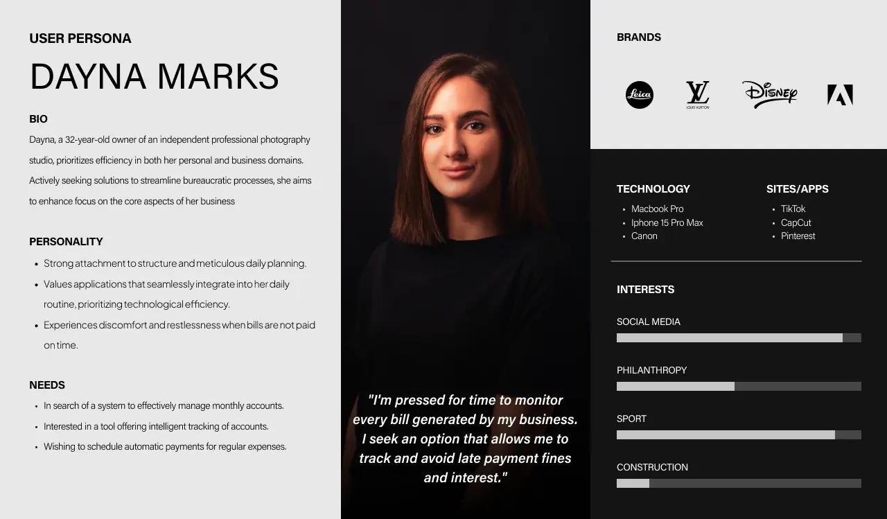
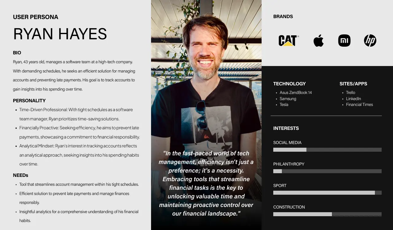
In acknowledging the profound customer desire for a multifaceted tool encompassing payment management, account centralization, and tracking, I recognized the pivotal role of crafting personas to inform design decisions.
As end-users, I formulated two personas representing distinct segments of the population, considering their interests, status, and other pertinent attributes. These personas serve as comprehensive profiles, outlining the characteristics of individuals interested in utilizing such a platform.
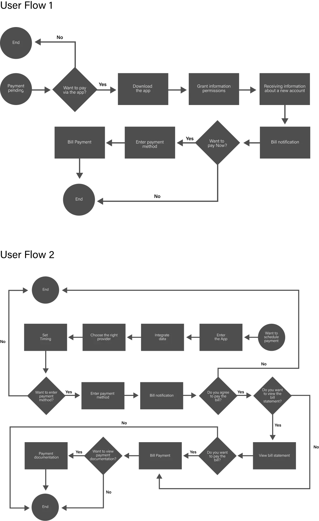
Understanding The Journey
The creation of a comprehensive journey map for identified user personas has uncovered emotional intricacies at various interaction points. To address these nuances effectively, tailored content adjustments based on user behavior within the application are crucial. It’s noteworthy that while payment automation offers convenience, it can also lead to confusion and lack of clarity. Therefore, presenting the journey coherently and ensuring clear navigation paths within the product are vital for the intelligent management of household or business monthly accounts.
The framing of this journey can significantly impact user retention or churn. Moving forward, prioritizing a clear, uninterrupted structure and integrating diverse feedback mechanisms, along with providing immediate responses to user needs, is essential. This approach will ensure a seamless and efficient user experience, promoting engagement and harnessing the full potential of the tool.
Mapping a Seamless Integration
Engaging in multiple rounds of rapid paper sketching highlighted the challenge of maintaining key tasks in a simple one-level format. This iterative process played a crucial role in identifying effective design patterns within EasyPay, revealing how users smoothly navigate between screens.
Identifying through Wireframe Prototypes
Utilizing wireframe prototypes, I pinpointed potential points of confusion. Following the sketching phase, I translated the envisioned flows into low-fidelity, clickable wireframes. Through user testing, these wireframes unveiled specific stumbling blocks, particularly around scheduling payments and accessing past payment records. These insights played a pivotal role in refining the design for seamless integration.
Enhancing User Experience Through Iterative Design
Moving directly from wireframe testing to high-fidelity prototyping, I incorporated insights obtained from earlier testing phases. My strategy focused on addressing identified friction points through careful copy refinement and integrating design patterns seamlessly within the established EasyPay experience. The overall testing results were highly successful, with the majority of tasks achieving a success rate of 74% or higher.
Embarking on the Design Craft
With the research phase completed and the application’s skeleton approved by the designated authorities, the exciting phase of crafting the design unfolded. Starting from scratch, I initiated the process by curating a color palette harmonizing seamlessly with the brand. Simultaneously, I sought a mobile-friendly font and endeavored to craft a distinctive design that not only aligns with the brand identity but also enhances user effectiveness within the application.
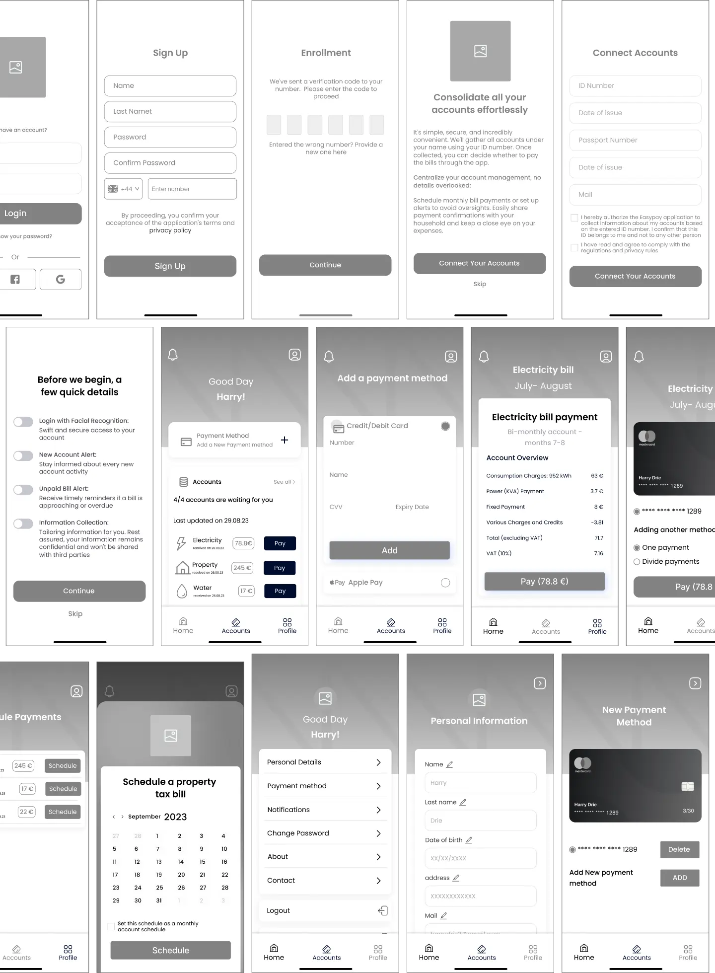
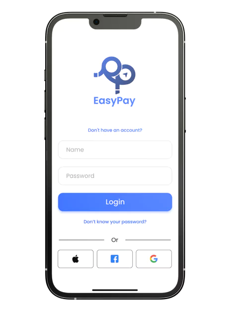
Sign in/ Sign up
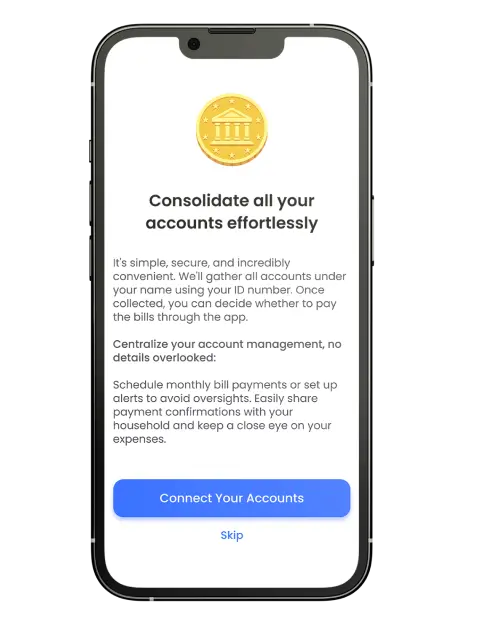
The user application’s authentication process is designed to provide a well-known and familiar user experience. To enhance user engagement and retention, individuals are initially introduced to the application with a chance to explore its features before entering personal details. This approach not only helps alleviate user resistance but also allows them to experience the application firsthand.
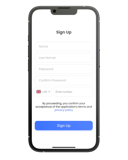
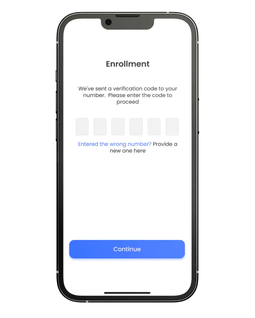
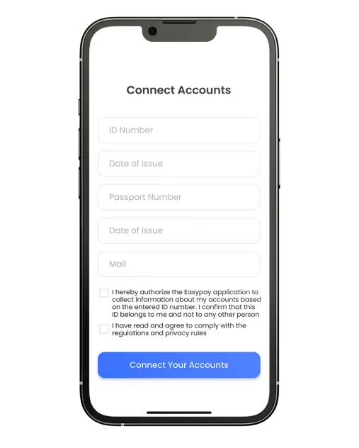
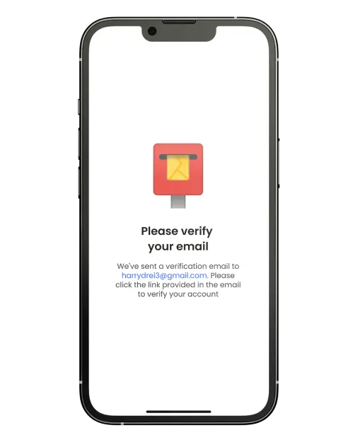
In alignment with information security and individual rights considerations, the collection of personal information involves a two-step identity verification, first through a mobile number and subsequent verification, and later through email verification upon connecting accounts. This streamlined process ensures a secure and efficient registration experience.
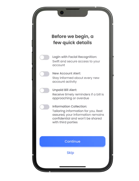
Following authentication, users are empowered to customize their notification preferences, providing them with control over the types of alerts they wish to receive. Post-registration, users can seamlessly link their accounts or explore the application’s functionalities at their own pace. Moreover, prior to entering personal information, users encounter informative text that offers a brief overview of the application’s functionality, providing a foundational understanding of its operation.
Consolidate Accounts
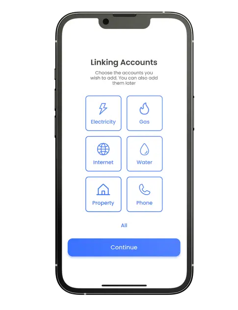
The next step in the user flow involves consolidating accounts, utilizing the second step of the two-step verification process through email, ID number, and passport number. Verification of the user’s email is a crucial part of this process, ensuring the security of the collected information. In the subsequent step, the user gains visibility into the accounts under their name and can choose which accounts to connect, with the option to connect all at once. Advanced information security tools are employed to prevent identity theft throughout this process.
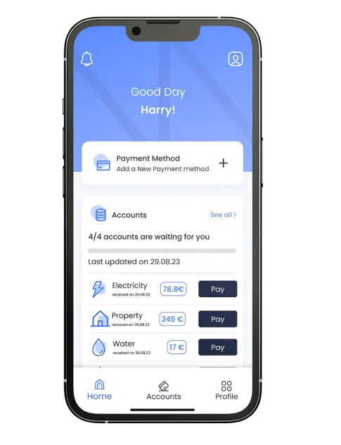
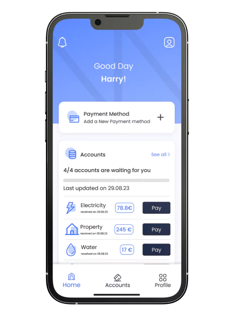
Main Dashboard and Accounts
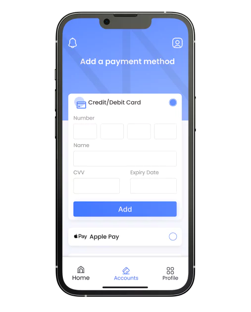
The home page functions as the focal point of the application, providing users with their initial exposure to the diverse features it offers. To optimize user experience, I organized the content in a scrolling feed format. The first section prompts users to enter their payment method, acting as an essential initial step. Subsequently, the display showcases the status of monthly payments, indicating the allowed and paid amounts.
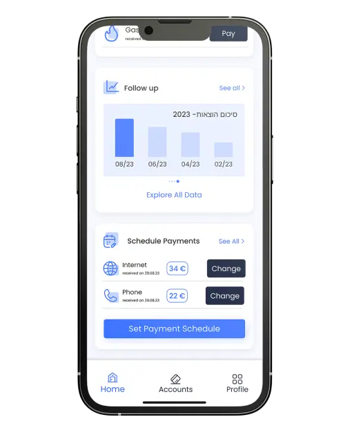
Continuing the scroll, the application offers analytical insights, such as average expenditure, percentage distribution, and detailed expense analysis. This feed-like scrolling design, reminiscent of popular social networks, minimizes cognitive load for users. The home page acts as a central hub, offering convenient access to various functions, including bill payments, addition of new bills, review of past payments, and more.
Payment Flow
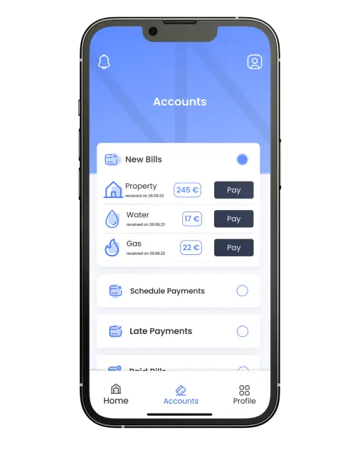
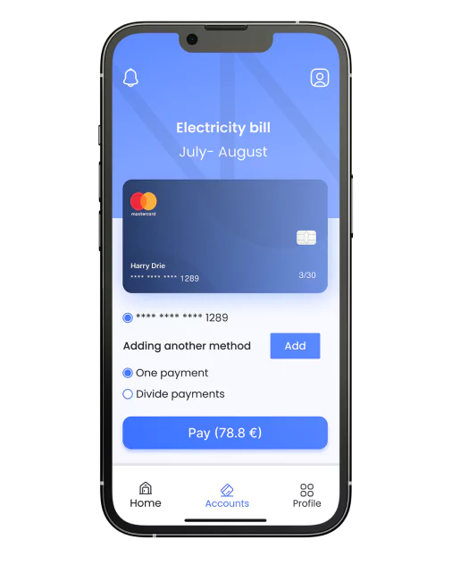
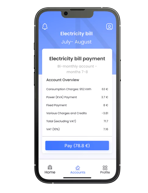
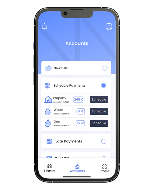
The payment process follows in the user flow. Users can choose a bill to pay either from the home page or by navigating to the bills tab at the bottom of the screen. This tab leads them to a page categorizing bills into sections like “to be paid,” “scheduled,” “overdue,” and “paid.” After entering payment information, including credit or debit card details, users receive account details and the total amount. The user can then proceed to make the payment directly within the app.
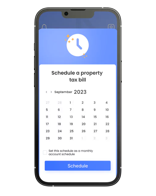
Schedule Payment
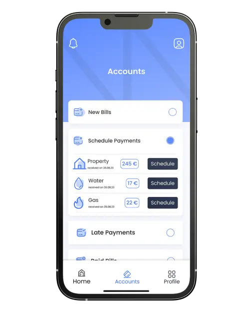
Users have the option to schedule bill payments, either based on a fixed date or upon receiving a new bill. For example, they can set up automatic payment for an electricity bill within 10 days of receiving it or specify a specific date for payment. The scheduling process is intuitive: users can manage their schedules in the “Scheduled Accounts” tab, where they can add or update schedules. When users select a date from the calendar, the scheduling process is complete.
Notably, the payment process requires user confirmation but doesn’t necessitate entering new details. This streamlined approach turns what could be a cumbersome process into a simple two-tap action, with users receiving a notification to confirm the payment.
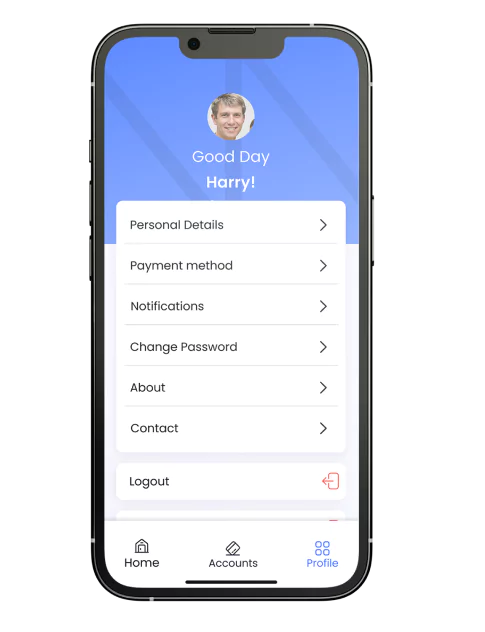
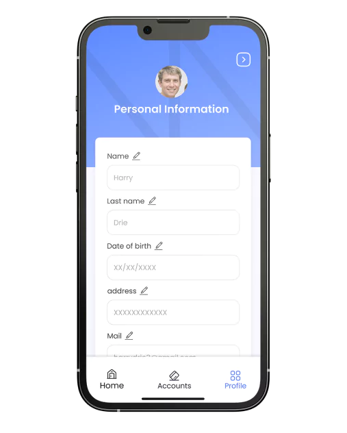
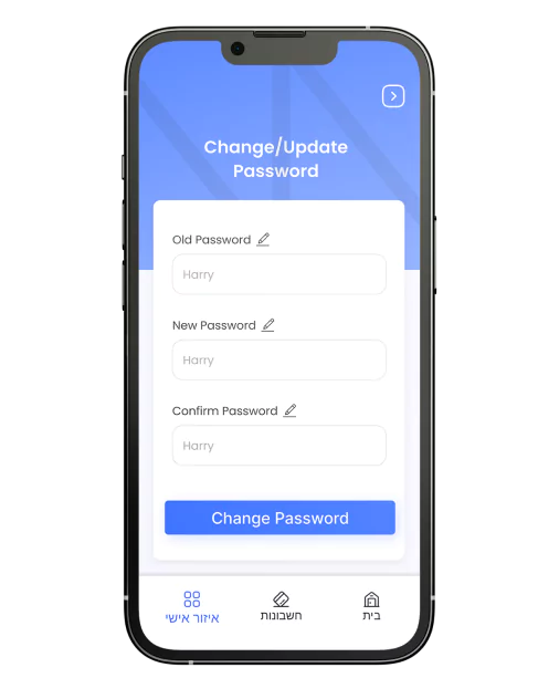
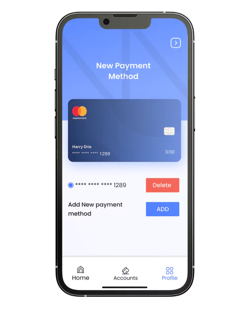
Profile
The profile section functions as a centralized hub where users can access and manage a range of information. Here, users have the flexibility to update payment methods, modify personal details, manage accounts, view receipts, and perform various other actions. This comprehensive area empowers users to maintain and personalize different aspects of their account.
Lessons Learned
Simplified yet Secure Data Collection:
A straightforward data collection process is crucial, showcasing safety to overcome user resistance. Utilizing multiple identifying details and implementing two-step verification adds an extra layer of security.
Efficient and Clear Process:
Unlike banking applications, the app's purpose is focused on quick and straightforward payments. The user journey should reflect simplicity, efficiency, and clarity.
Continuous Feedback:
Users value continuous feedback during task completion, providing a sense of progress and assurance throughout the process.
Tailored Task Process:
Acknowledging the distinctiveness of the task process compared to other applications prompted the inclusion of initial explanations for each function and the integration of micro interactions to guide users effectively.
Adapting to Diverse Literacy Levels:
Recognizing the diverse literacy levels within the target audience emphasized the need for a user experience and interface suitable for both advanced users and those new to such applications.