Savor a Cup of Coffee Amidst the Serenity of World-Class Beaches
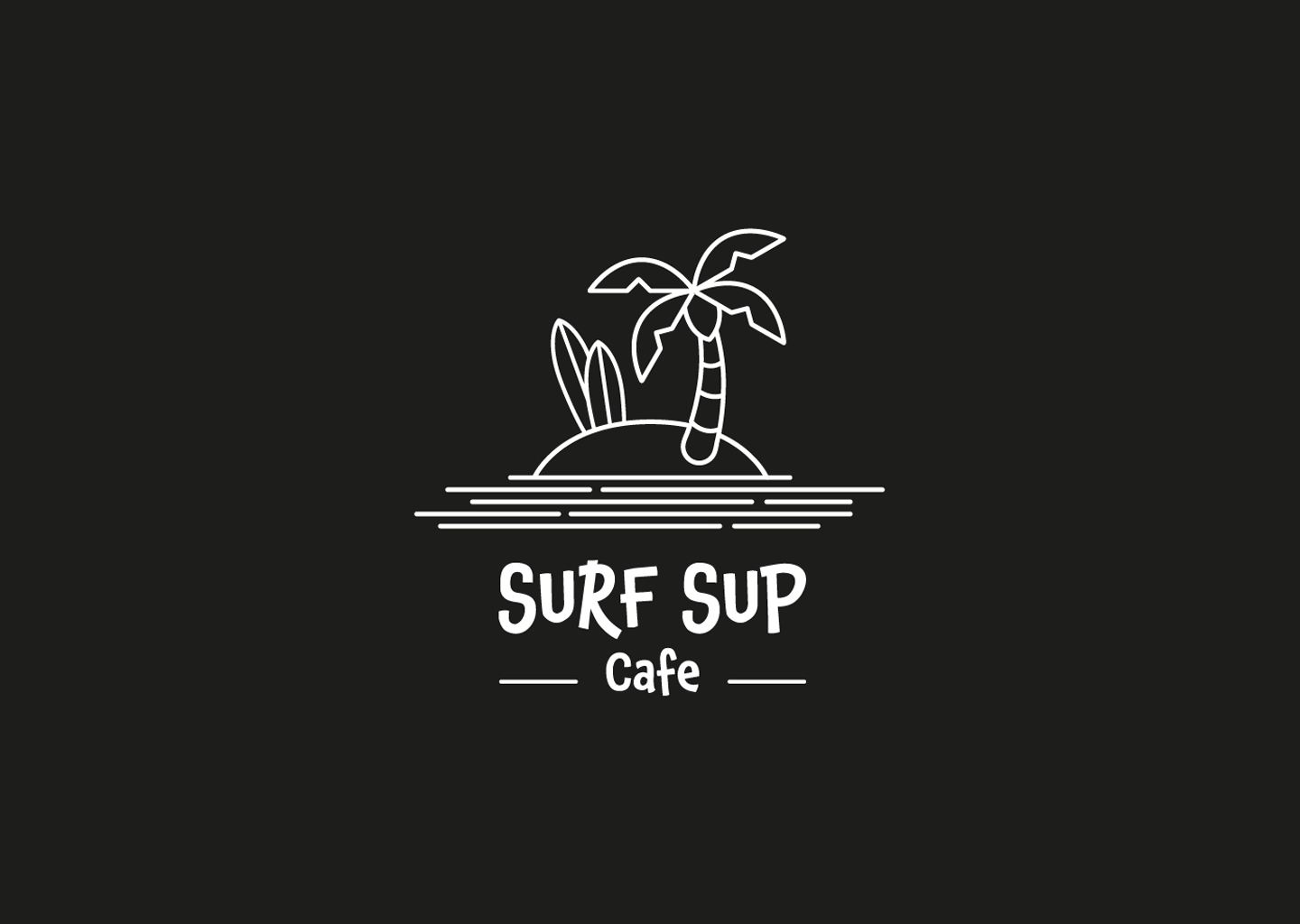
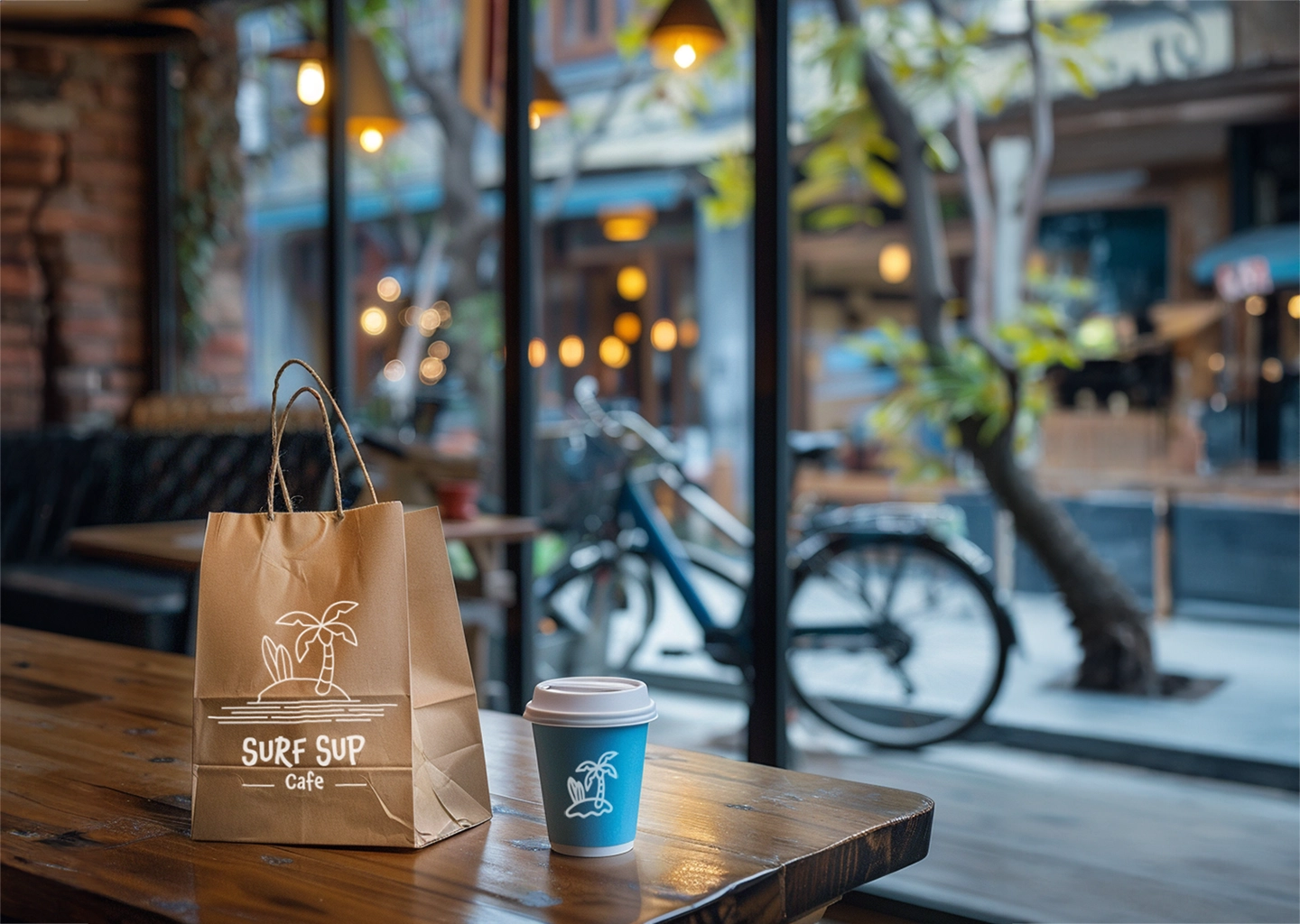
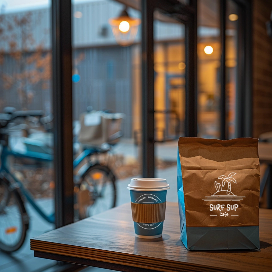
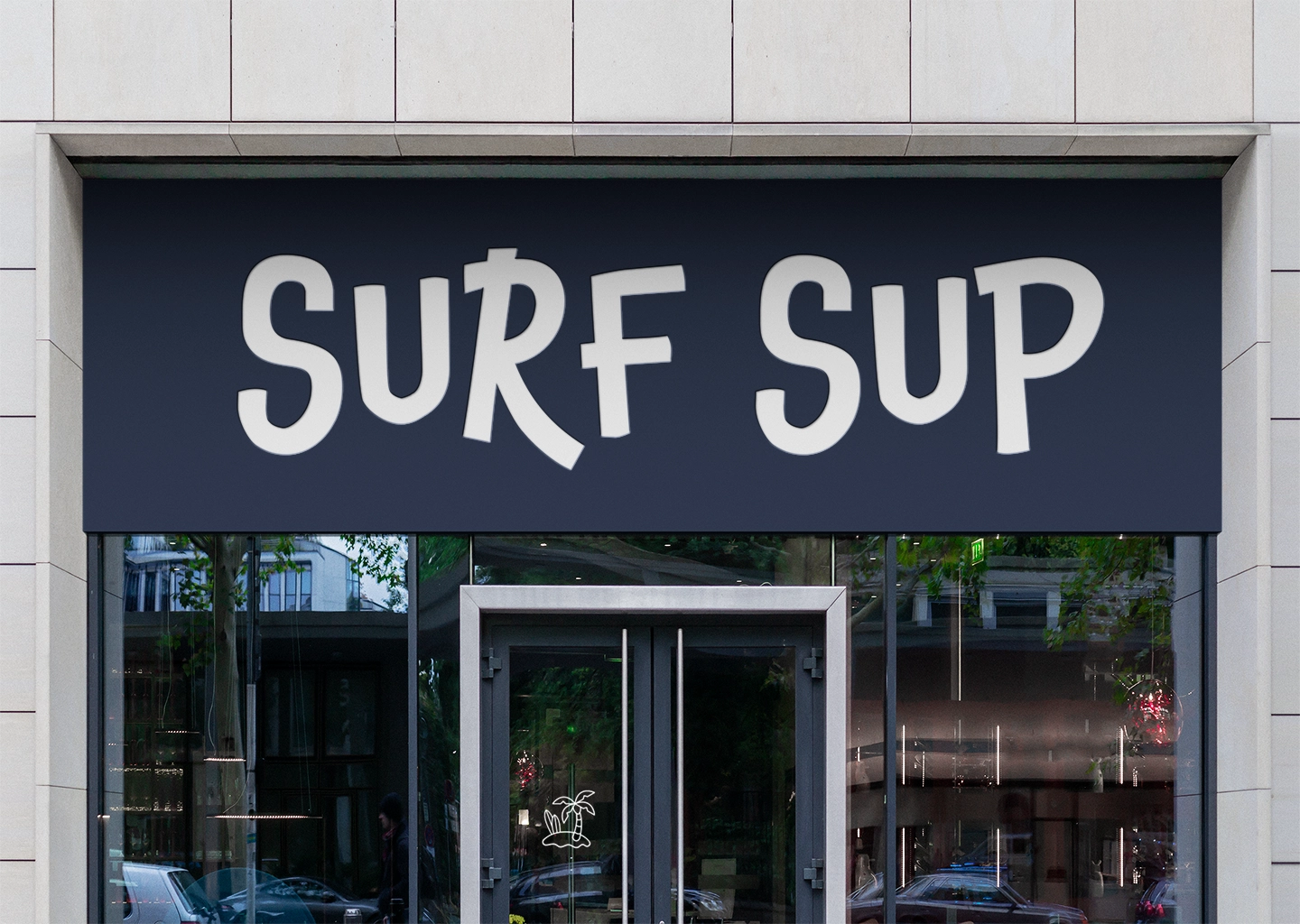
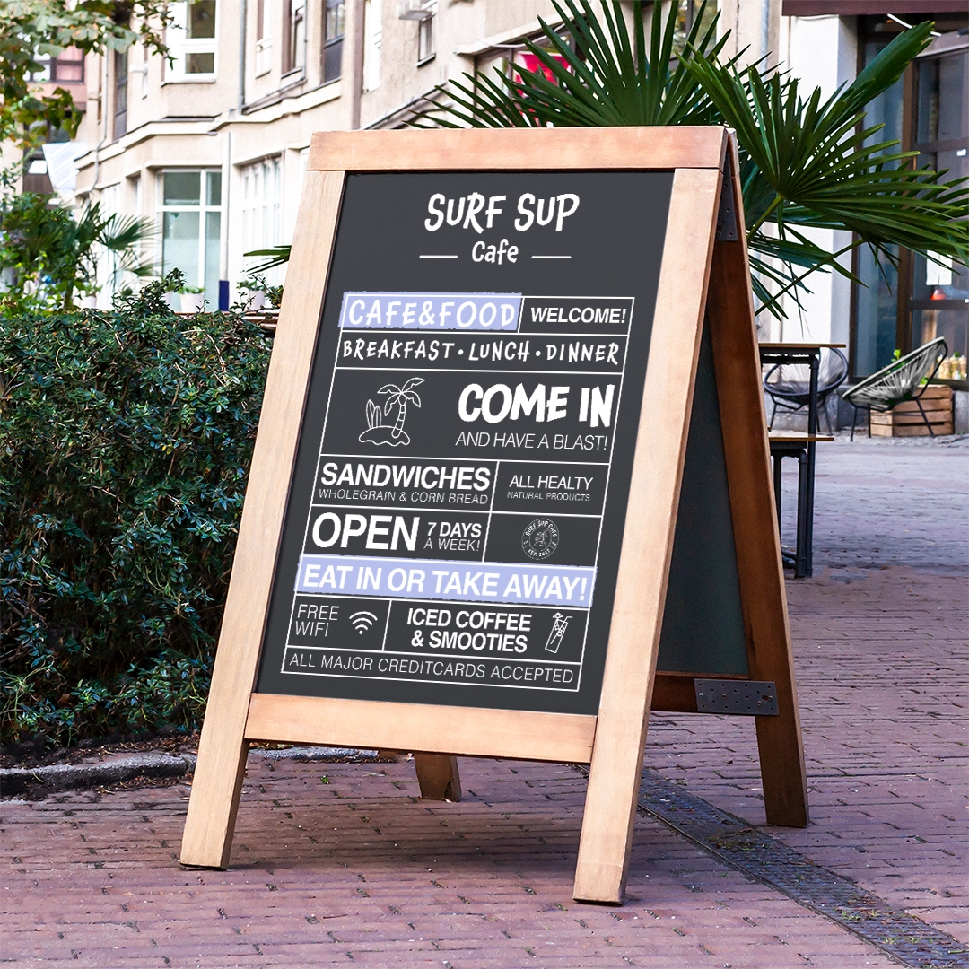
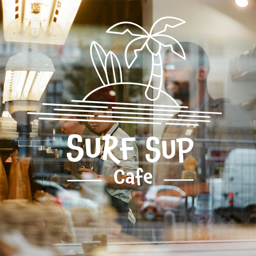
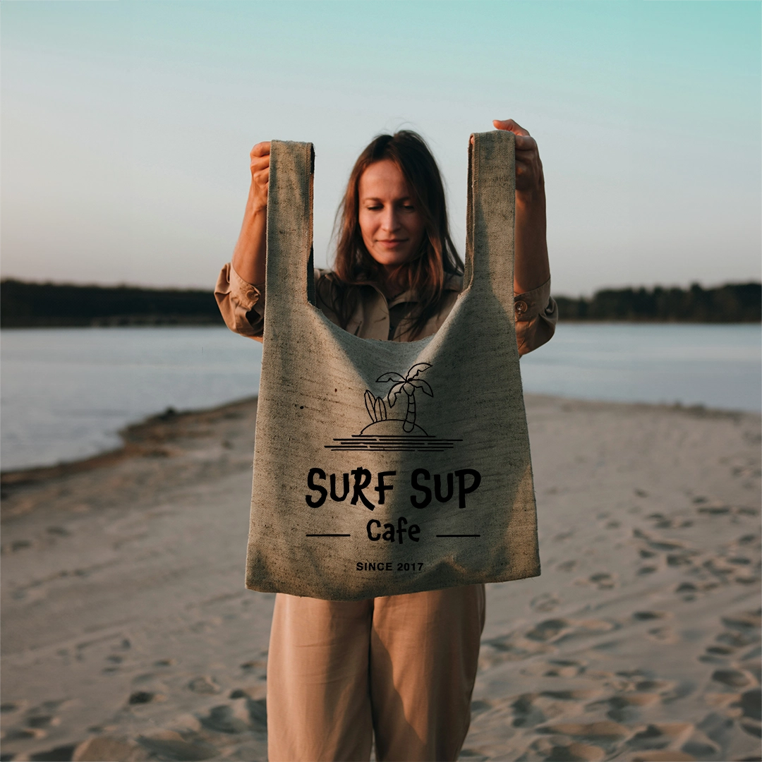
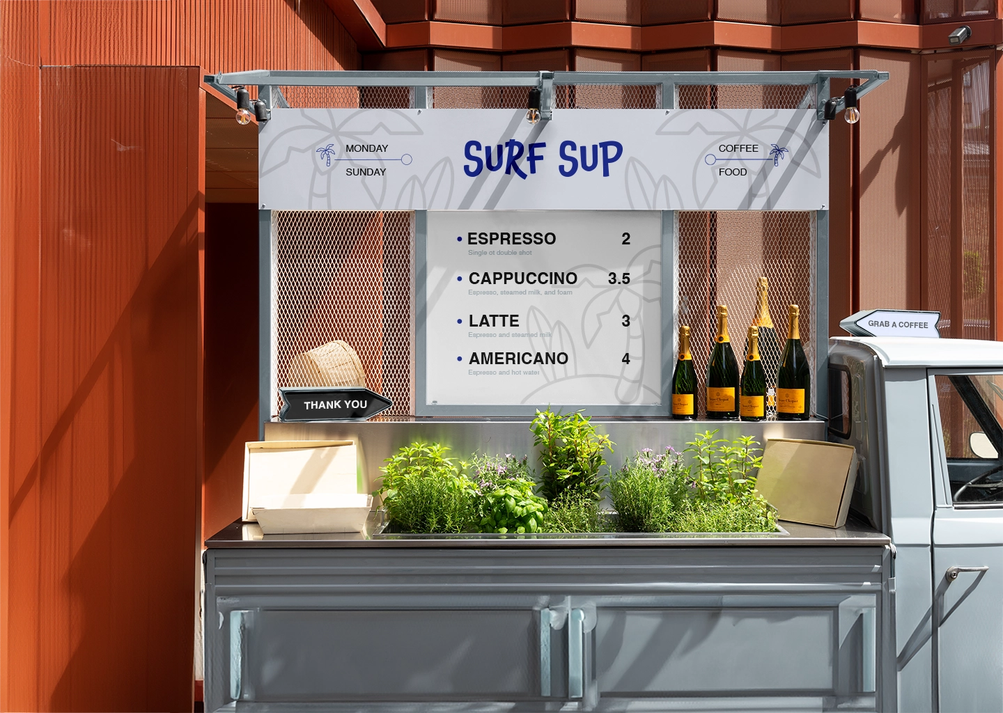
Surf Sup, nestled in Sydney, Australia, offers more than just coffee—it’s an experience. With its laid-back beach vibe and prime location, the café embodies the essence of relaxation and enjoyment. The name “Surf Sup” is a playful nod to the surfing culture, signaling that the waves are perfect for catching a ride. Whether you’re hitting the waves or simply seeking solace by the shore, Surf Sup provides the ideal setting to savor a delicious cup of coffee amidst the tranquil atmosphere.
Embracing the Spirit of Freedom
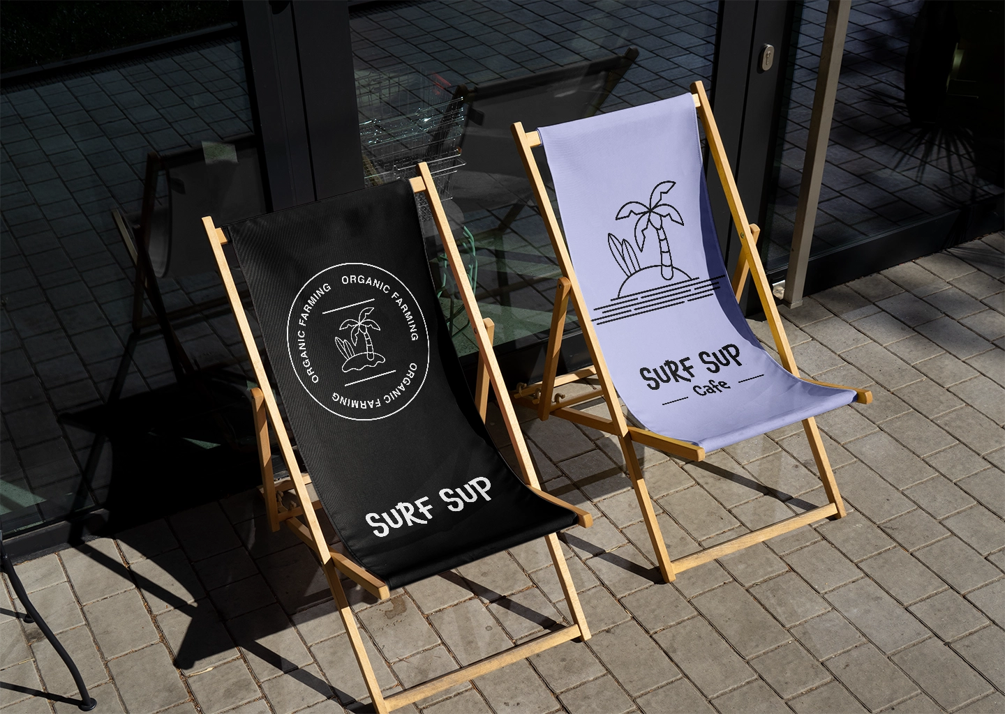
Throughout the design process, the concept of freedom resonated deeply with the team at Surf Sup. They sought to create a sanctuary where customers could experience a sense of liberation and peace amidst the ocean’s vast expanse.
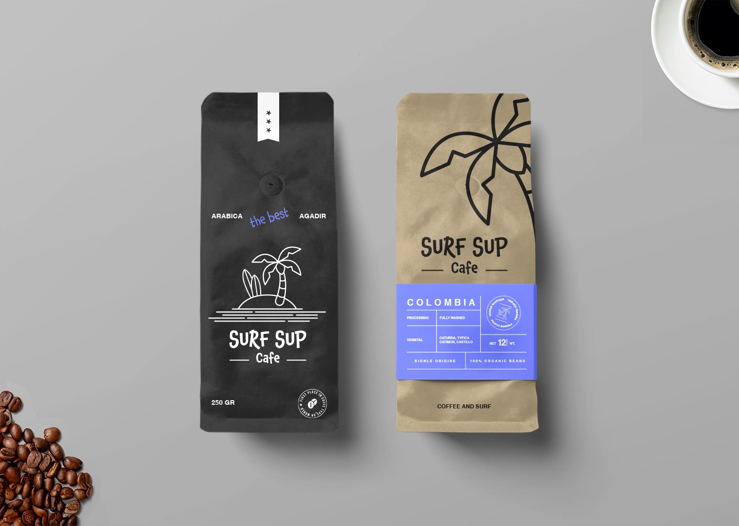
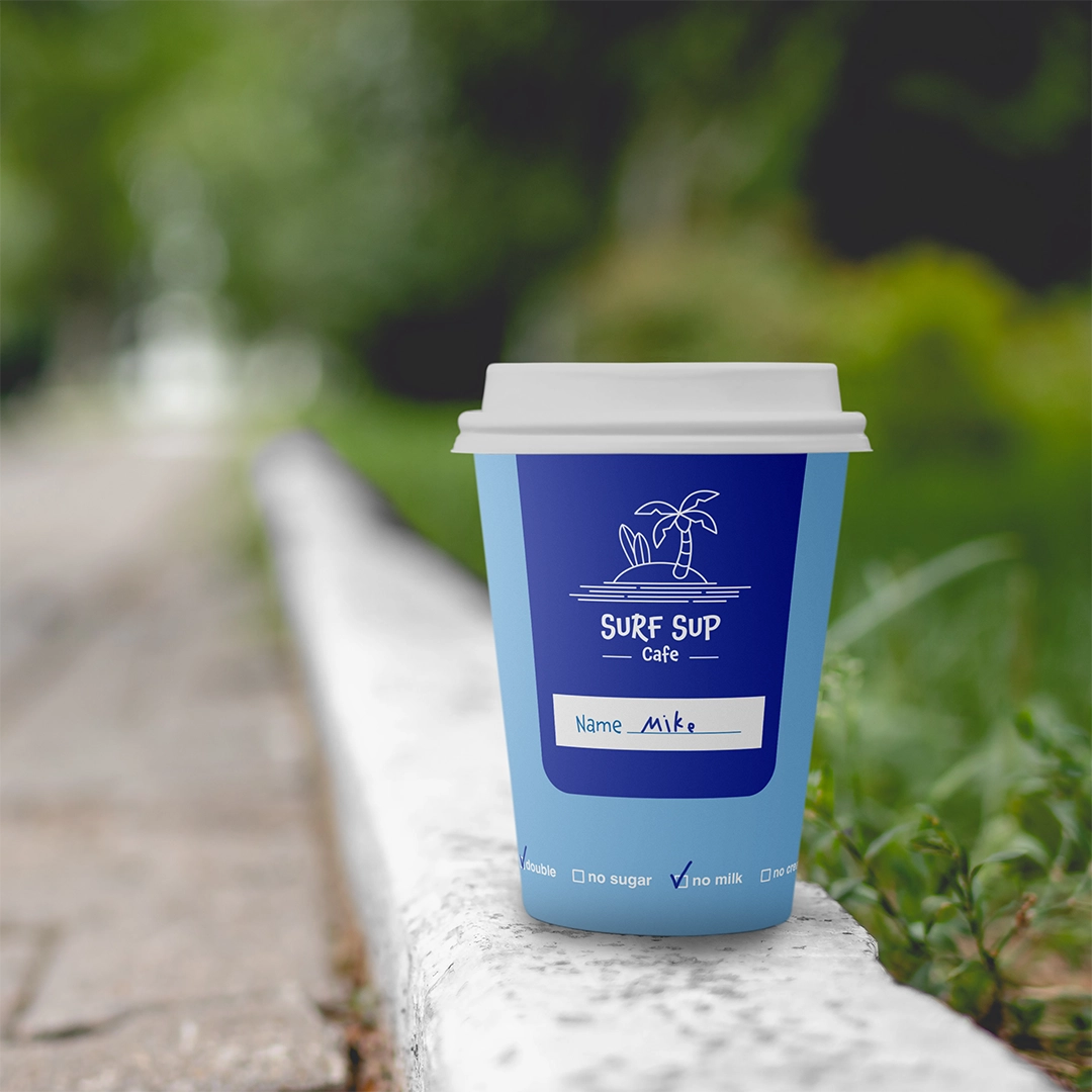
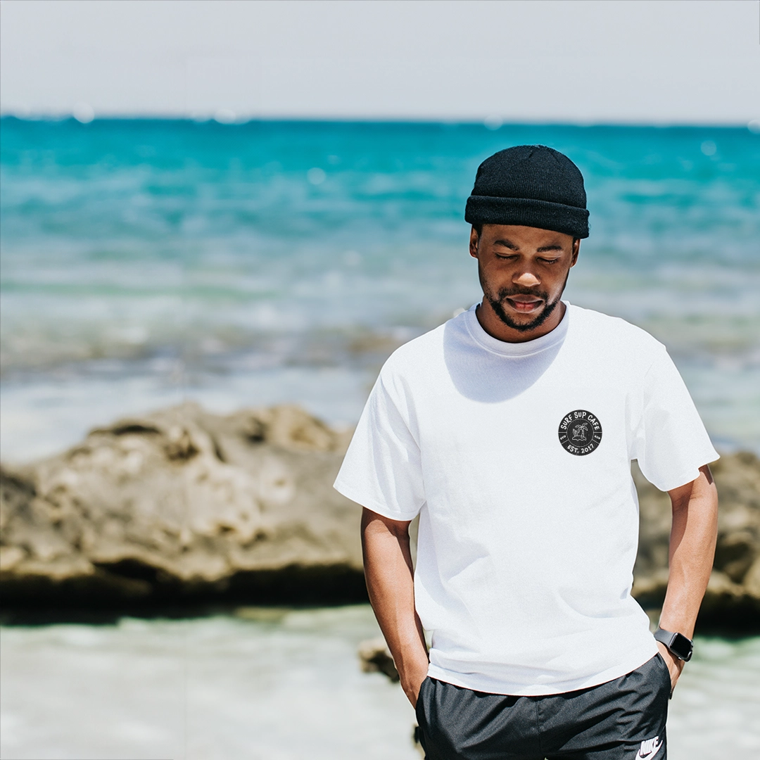
In crafting the brand identity, I envisioned a metaphorical island—a sanctuary of tranquility and calmness amidst the bustling world. An illustration depicting this serene island became the centerpiece of the brand’s design direction, symbolizing the solitude and freedom that Surf Sup offers its patrons. The design language is characterized by an illustrative style that evokes the boundless sea and the freedom it represents. The color palette, predominantly shades of blue, mirrors the vastness of the ocean surrounding Surf Sup, while maintaining a clean and orderly aesthetic to enhance the feeling of peace and serenity.
"Shahaf's remarkable efforts have infused our project with a fresh energy, shining a spotlight on the excitement we provide and our dedication to crafting lasting experiences. His work perfectly captures the essence of what we aimed to achieve."